Travel Marketplace
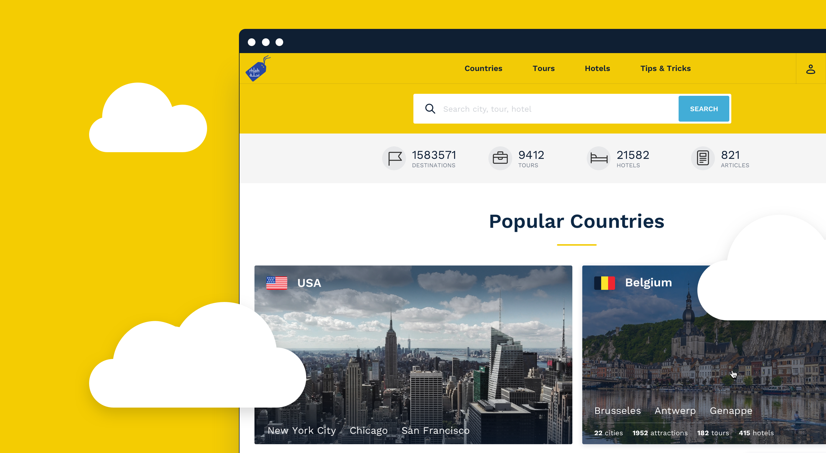
Our customer’s goal was to fill a niche in the travel market of Saudi Arabia with an innovative user-friendly travel portal for planning trips, booking tours and hotels and communicating with fellow travelers.
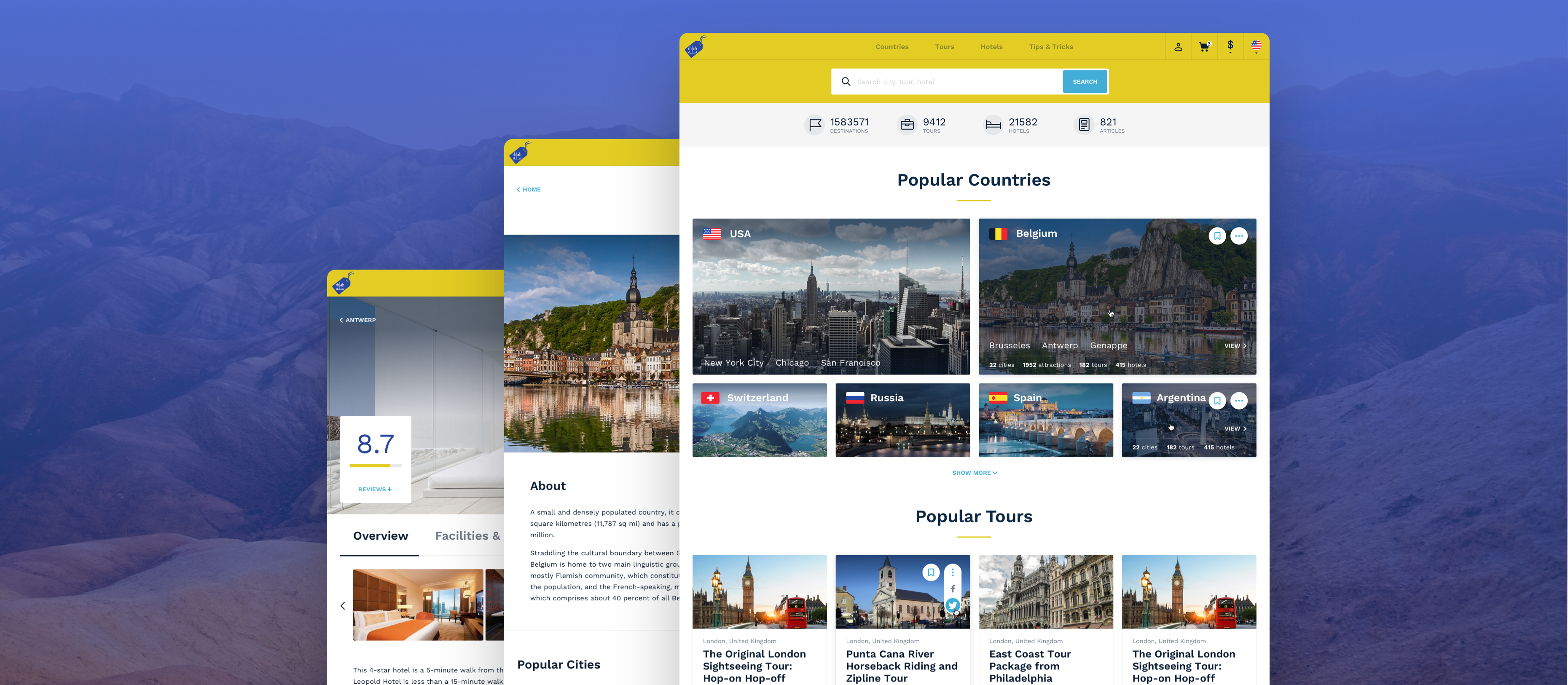
Agente team created a custom travel platform design from scratch. We created the use cases for different types of users and built user experience and user interface design for over 50 pages of the platform.
What is Rhlah?

Rhlah is an online travel portal where customers from Saudi Arabia can search for the travel destination for their next trip and share their experiences with others.
Process

Creating Use Cases
Every tourist goes through a few steps before and after traveling: searching for the destination, reading some tips and tricks, buying tours, rating their experience afterwards, etc.
Understanding the traveler goals during each phase and building use cases based on them has helped us come up with intuitive solutions for the travel portal we are building.
Building Information Architecture
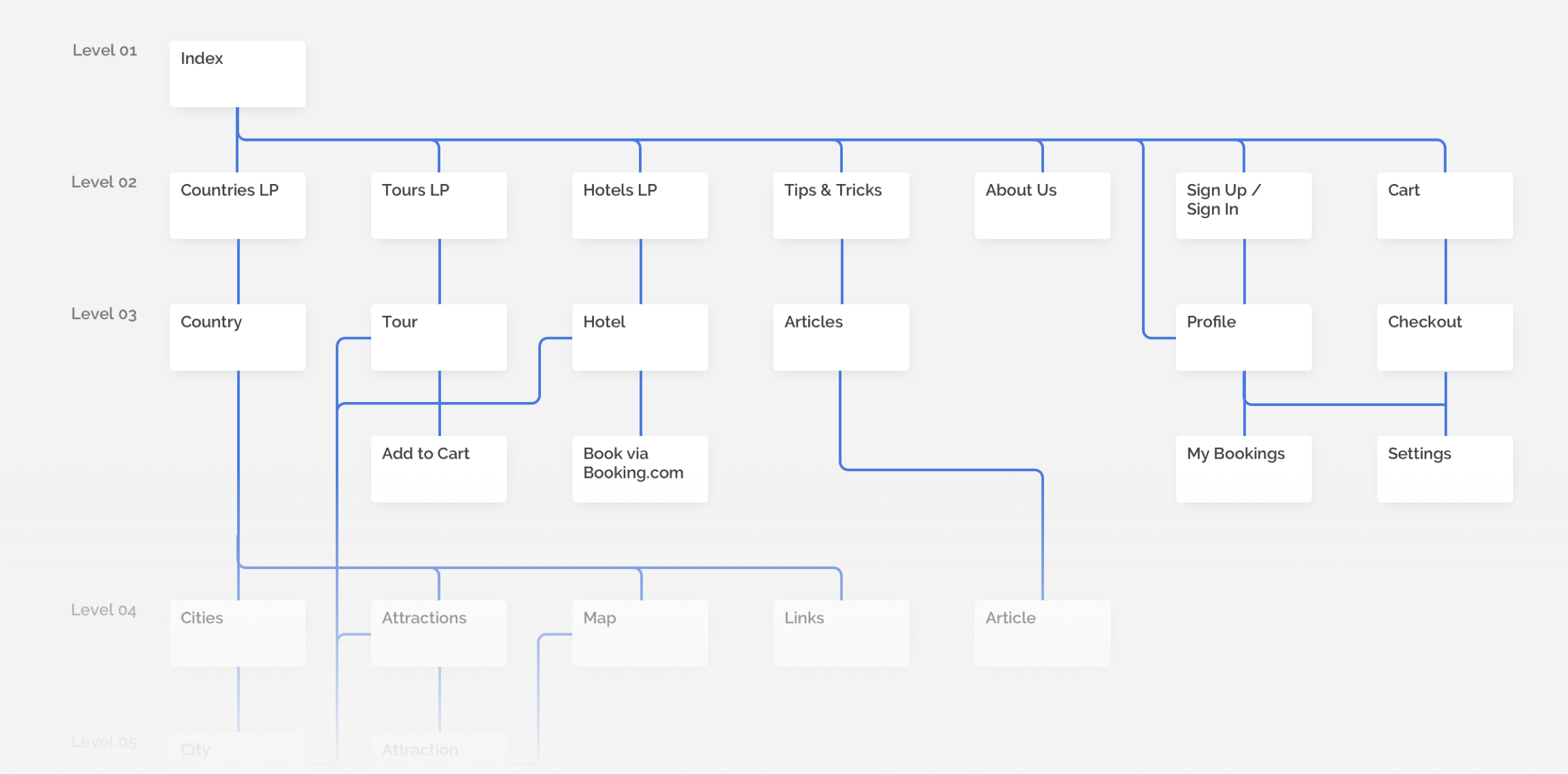
Based on the use cases we built in the previous phase, we structured the hierarchy and distribution of information with information architecture. All routes were designed to solve a traveler’s goals as fast as possible.
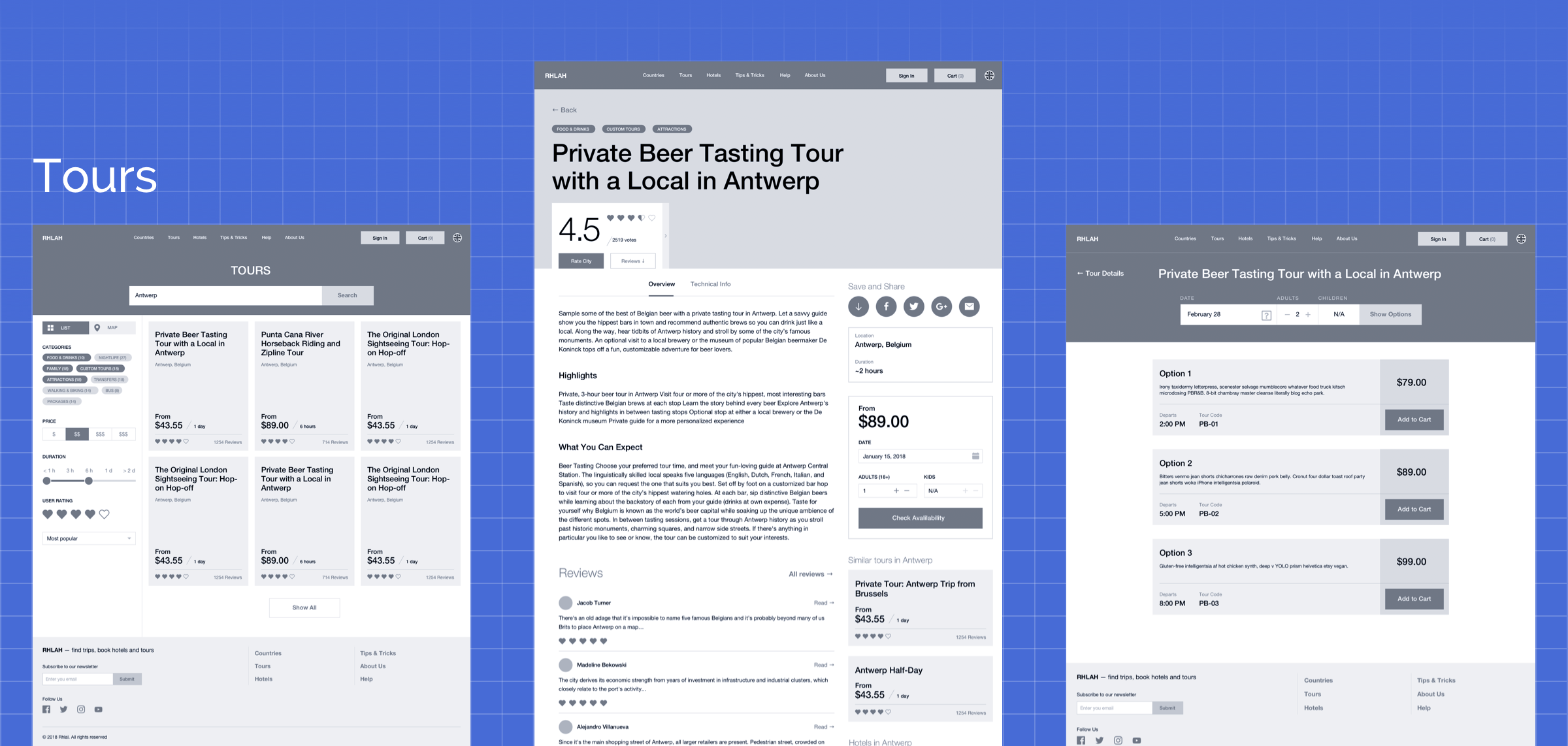
Designing Hi-Fi Wireframes
The next step was to design the set of consecutive screens for each of the website’s section. First, the traveler discovers the destination they would like to visit in the Countries section.
Then they look for a tour of the selected country in the Tours section and eventually they book a hotel and tour using checkout functionality. Thirdly, they gain information from the Tips and Tricks section.
Creating visual interface
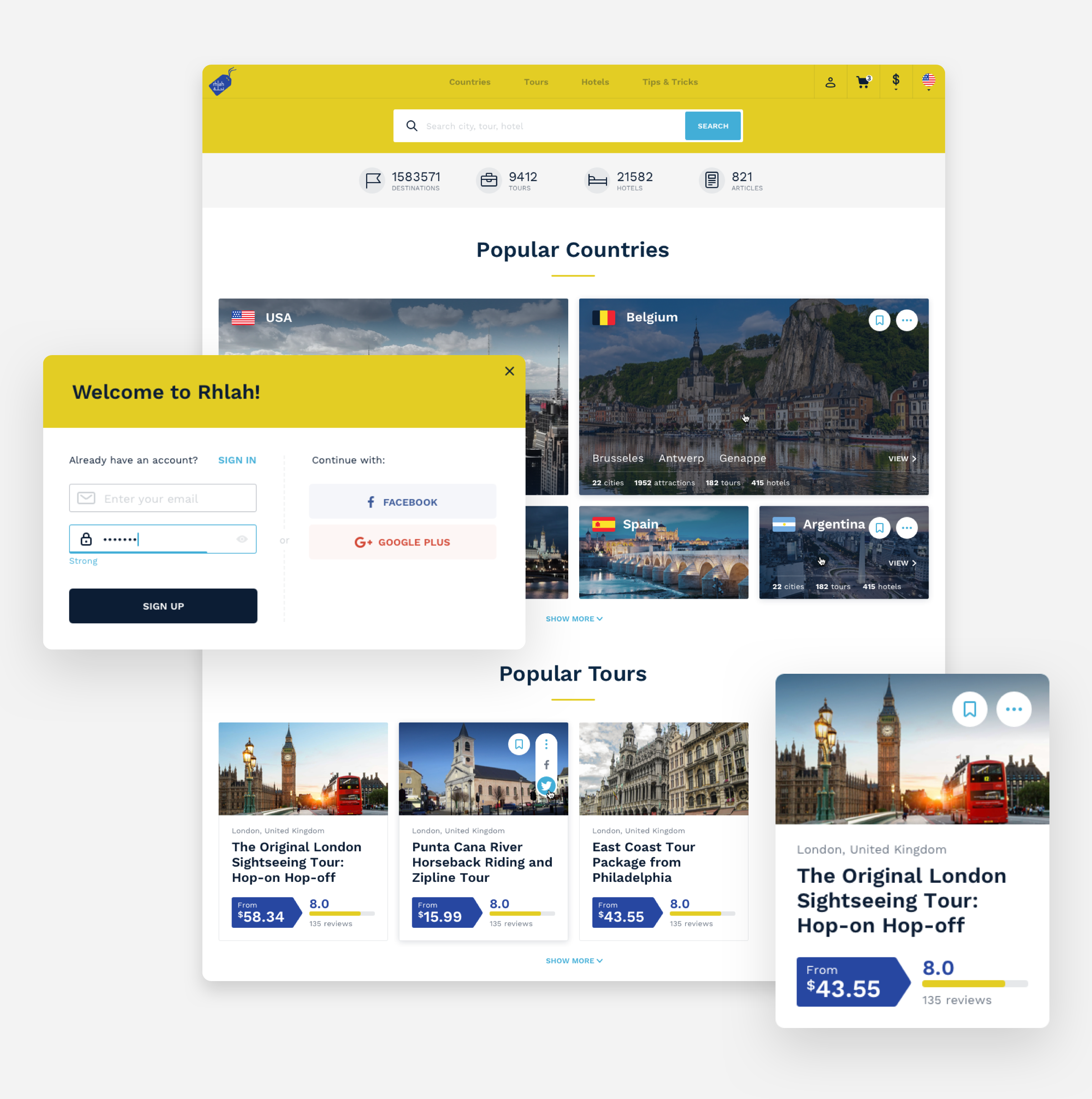
Finally, we organized the final user interface and featured each of the screens with custom interactive elements, such as filtering system, subscription pop-ups, checkout forms, and different third-party widgets styled to fit the brand identity of Rhlah.
Tours
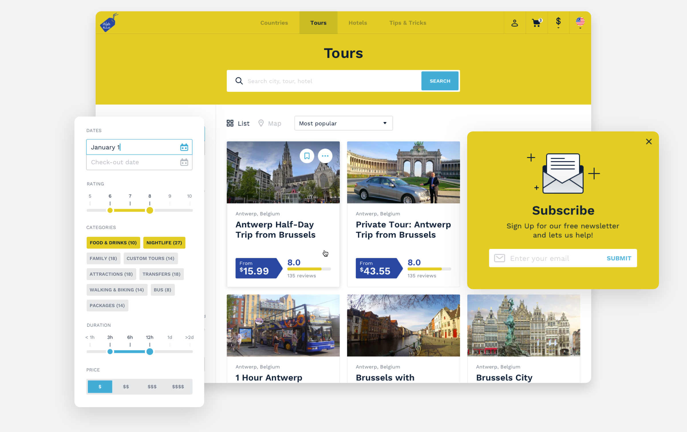
The target action for a user on the travel portal is to buy a tour. Other sections of the app serve as decision-making triggers, that inform travelers the degree to which each of the destinations matches their experience. The Tours section informs tourists about the price condition, rates, feedback, and allows for comparisons of various offers.
Tour
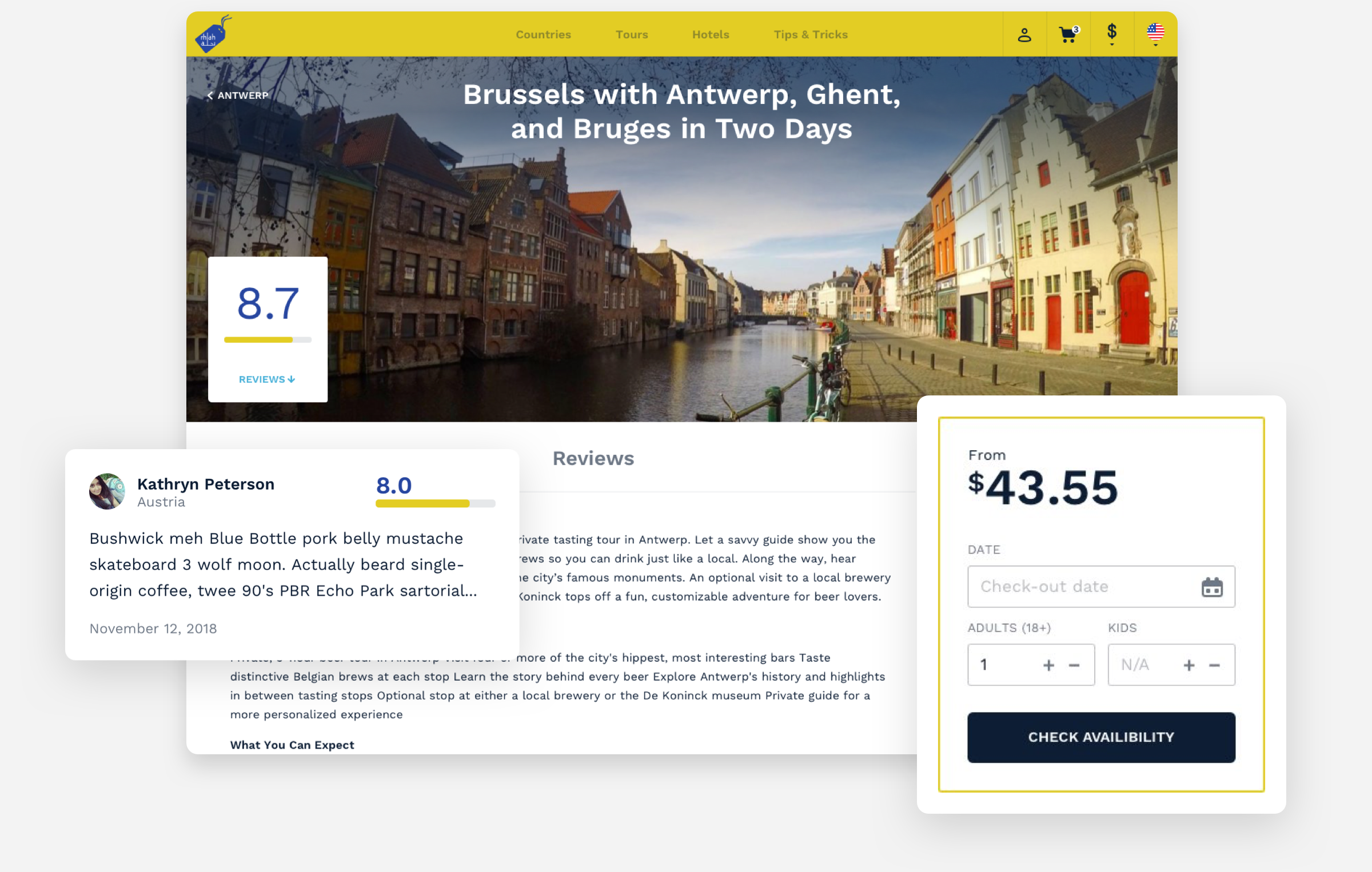
In the Tour section, a traveler can book the exact tour required, read feedback and recommendations from peers and filter out tours according to personal preferences. Apart from booking, users can leave feedback, and also read reviews and recommendations in the City section.
City
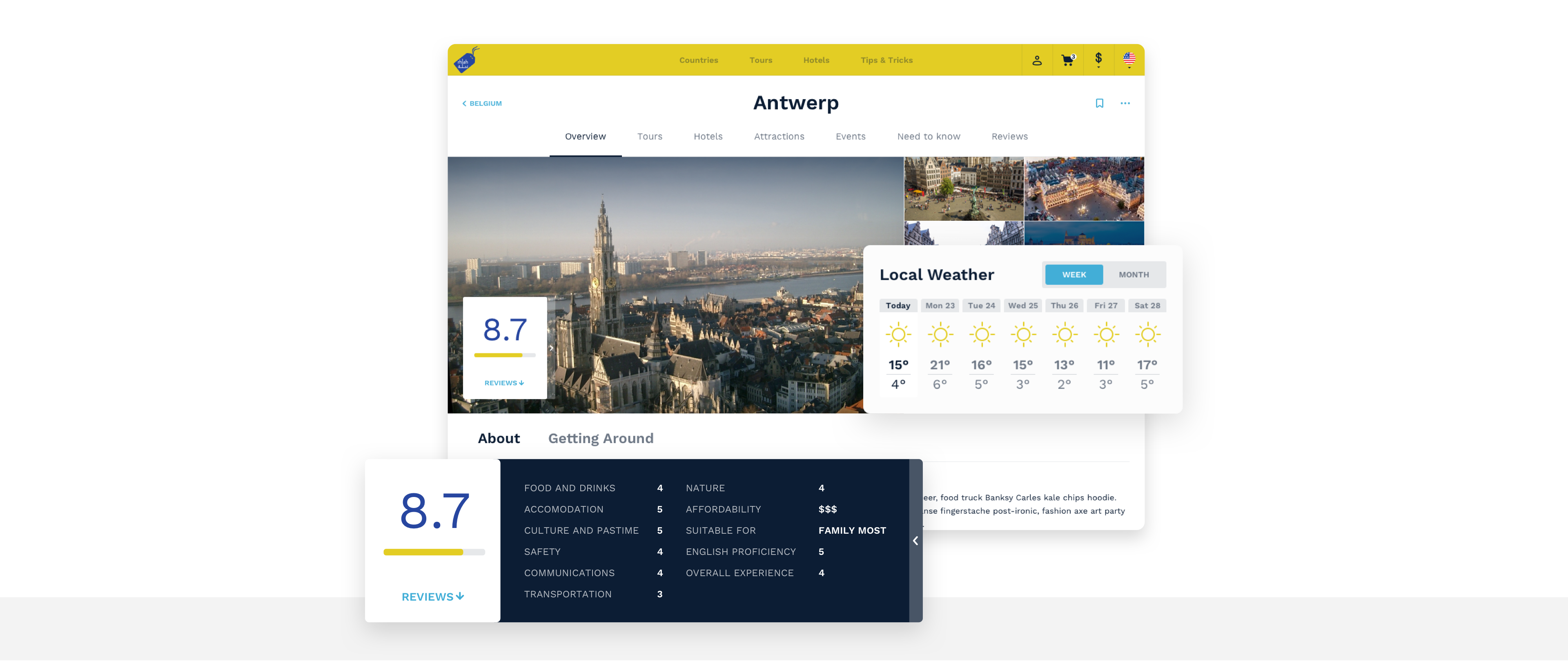
From the Tour section, users can navigate to the page of the destination city and explore its facilities. They can find important information and statistics about the City that’s being visited: its weather, safety, accessibility, etc. Here you can also compare the other available tour offers from each tour provider.
Styleguide
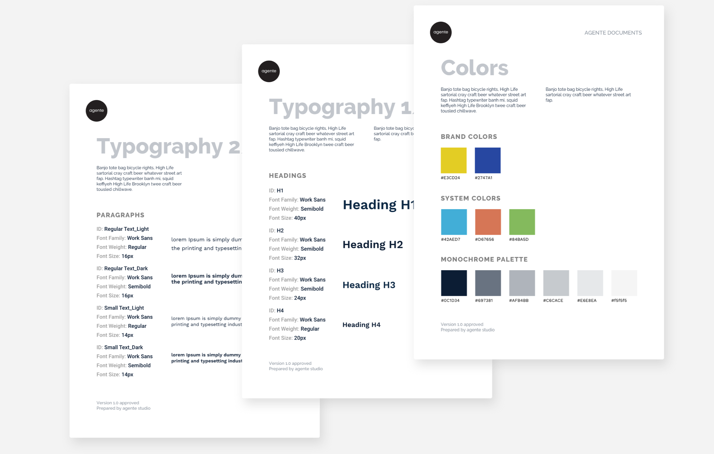
During the travel platform design process, we also worked on the style guide that holds elements, patterns, and specific components that repeat across pages, enabling designers and developers to reuse them on any page.
Result
The final travel platform holds a well-thought user experience strategy and helps increase tour sales and user conversions.
We hope that Rhlah can offer a decent competition to the major global travel apps by providing an exclusive user experience for Saudi Arabian travelers.

