E-commerce platform
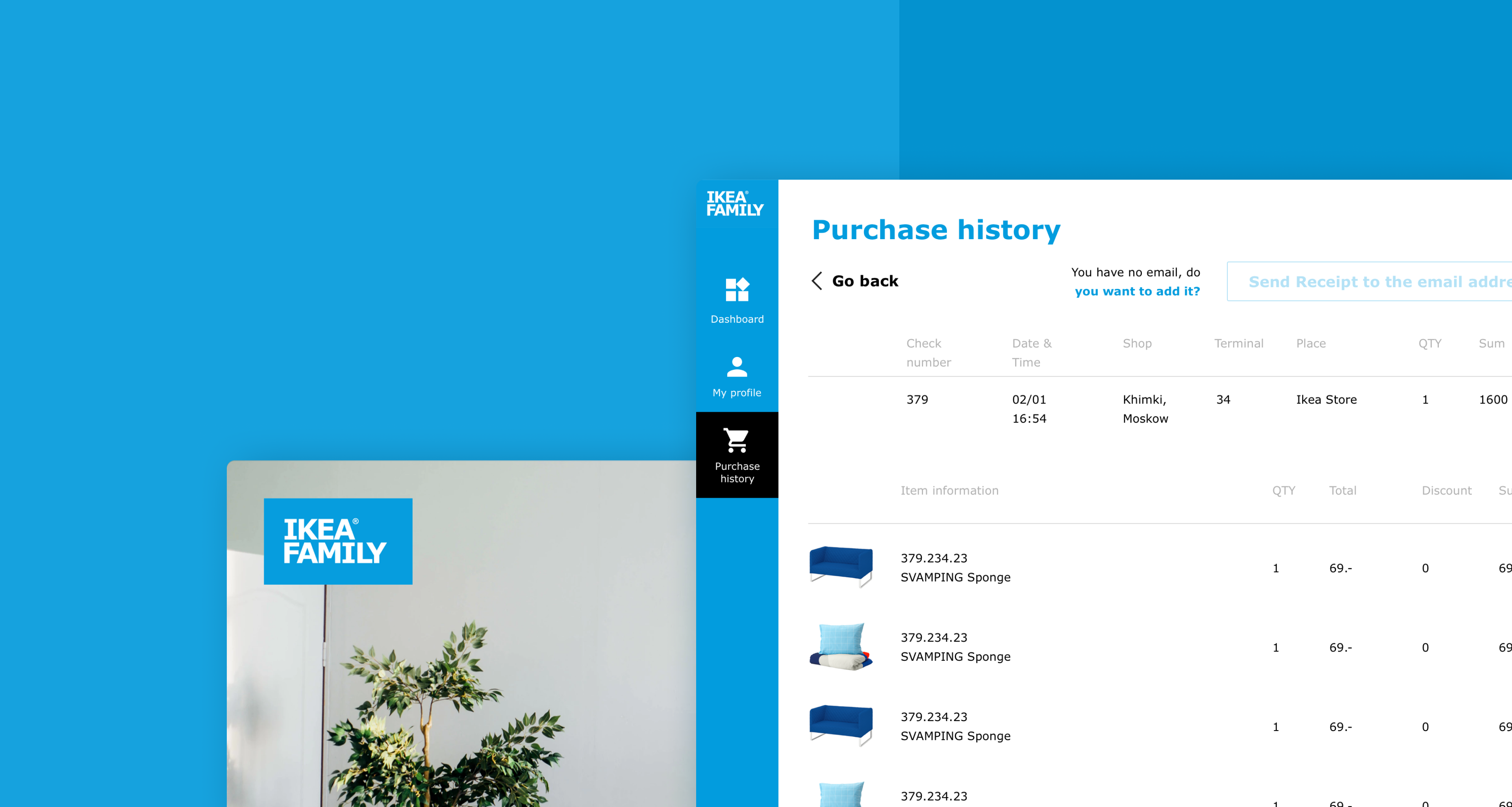
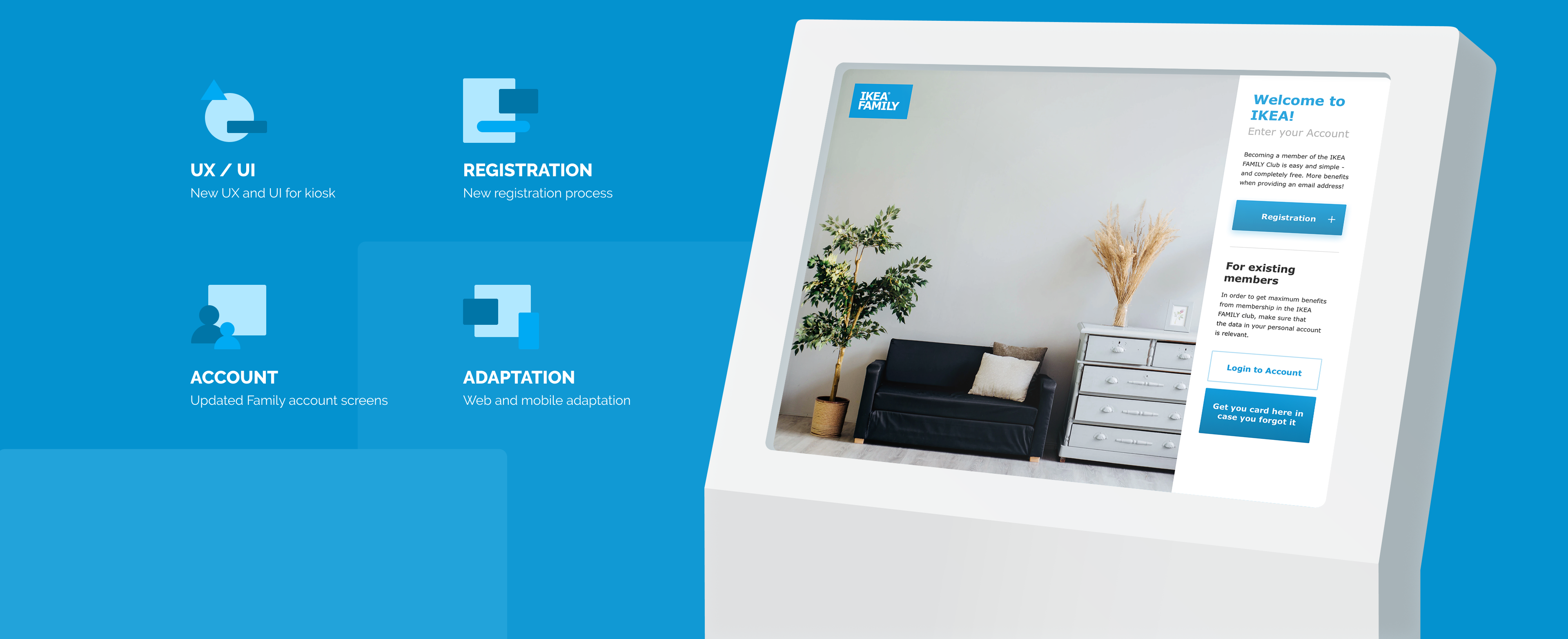
IKEA Russia has requested us to update IKEA Family Kiosk and online application. Also, we designed the IKEA Business app as an extension to the IKEA Family.
With the updated design, IKEA improved customer satisfaction, individualized communication based on different customer segments, and got more specific insights on their clients.
IKEA Family Kiosk
IKEA Russia has requested us to work on updated Kiosk and Online application changes which include various functionality, user experience, and user interface improvements. The project has been split into several phases, described below in detail:
DASHBOARD
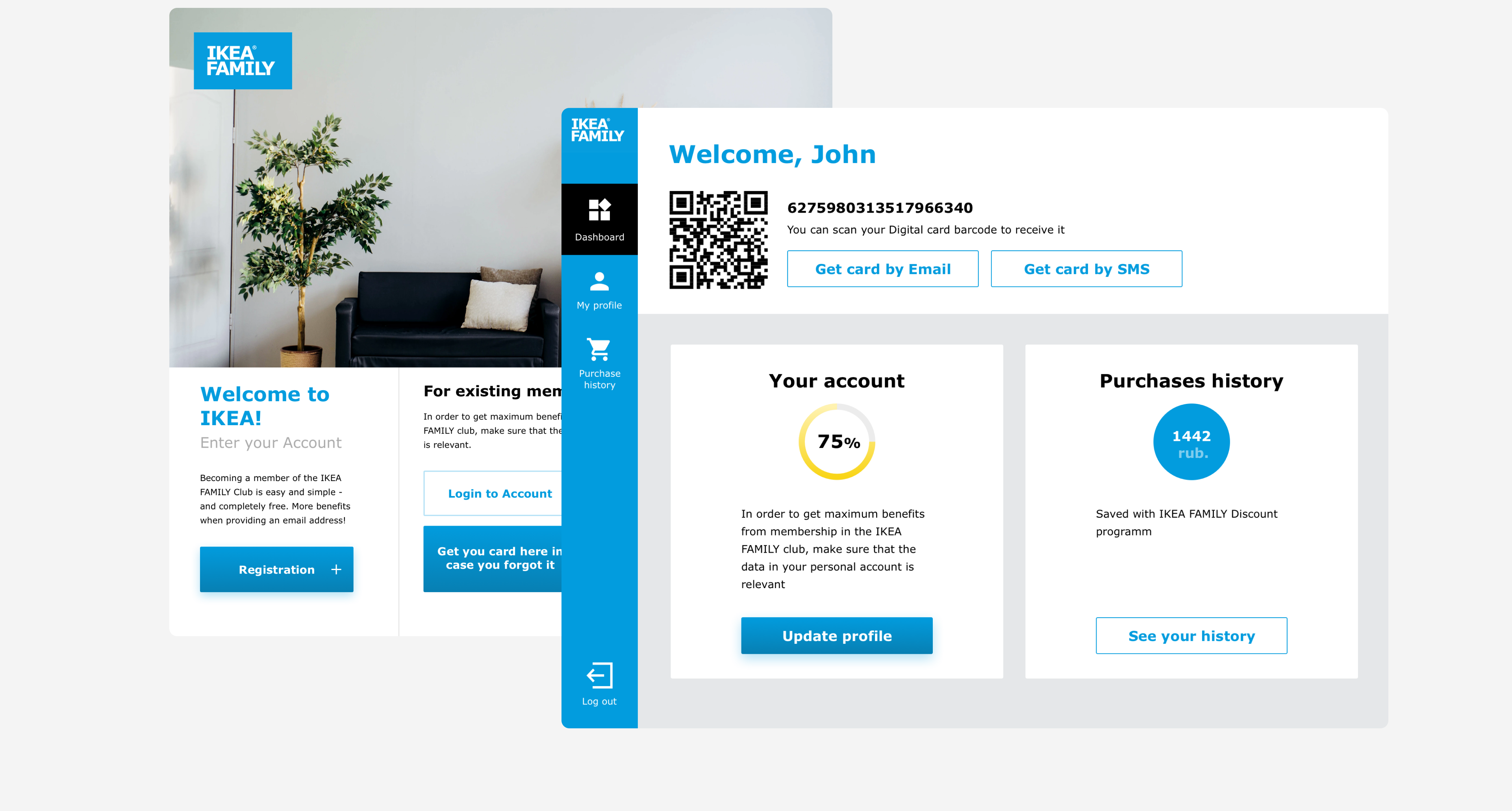
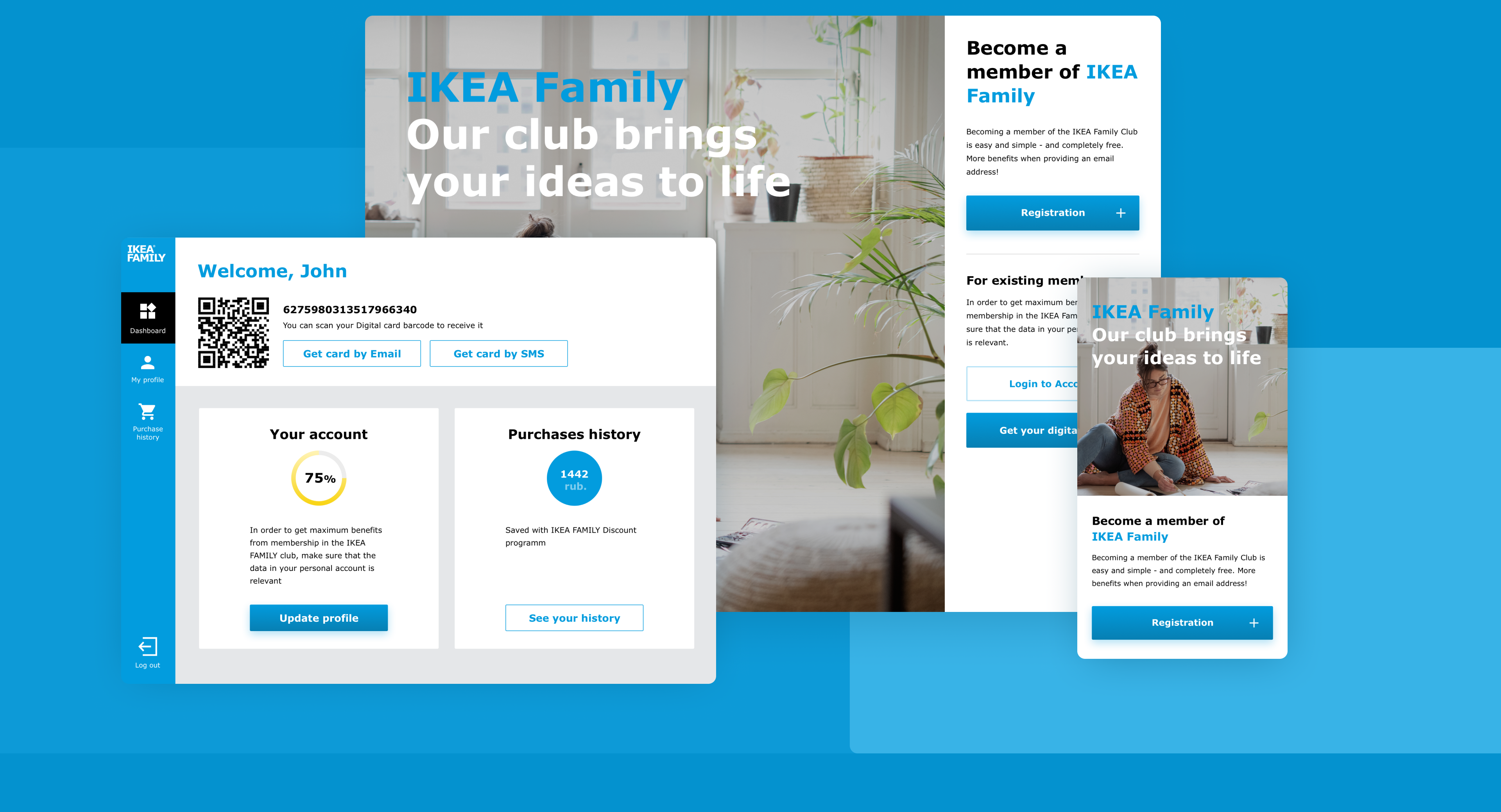
We kept the dashboard section minimalist and sleek. The main functionality included a scannable family card, personal info and purchase history visualized in simple graphs that showed how much of the profile is completed and how much has been saved by the member using a family card.
GETTING IKEA FAMILY CARD
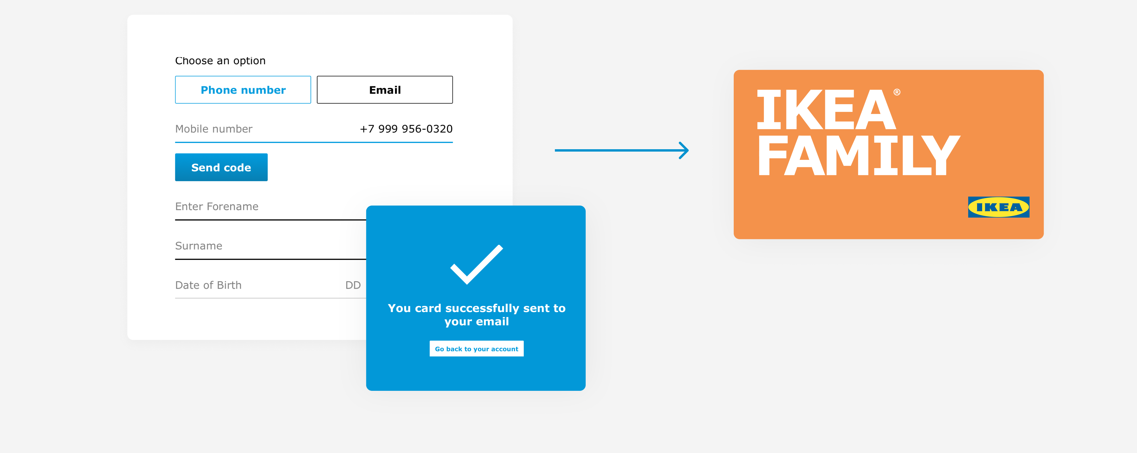
Here we designed the flow for getting IKEA Family card, starting from the step of registration and joining the club to verifying an email or a mobile number and sending a digital card.
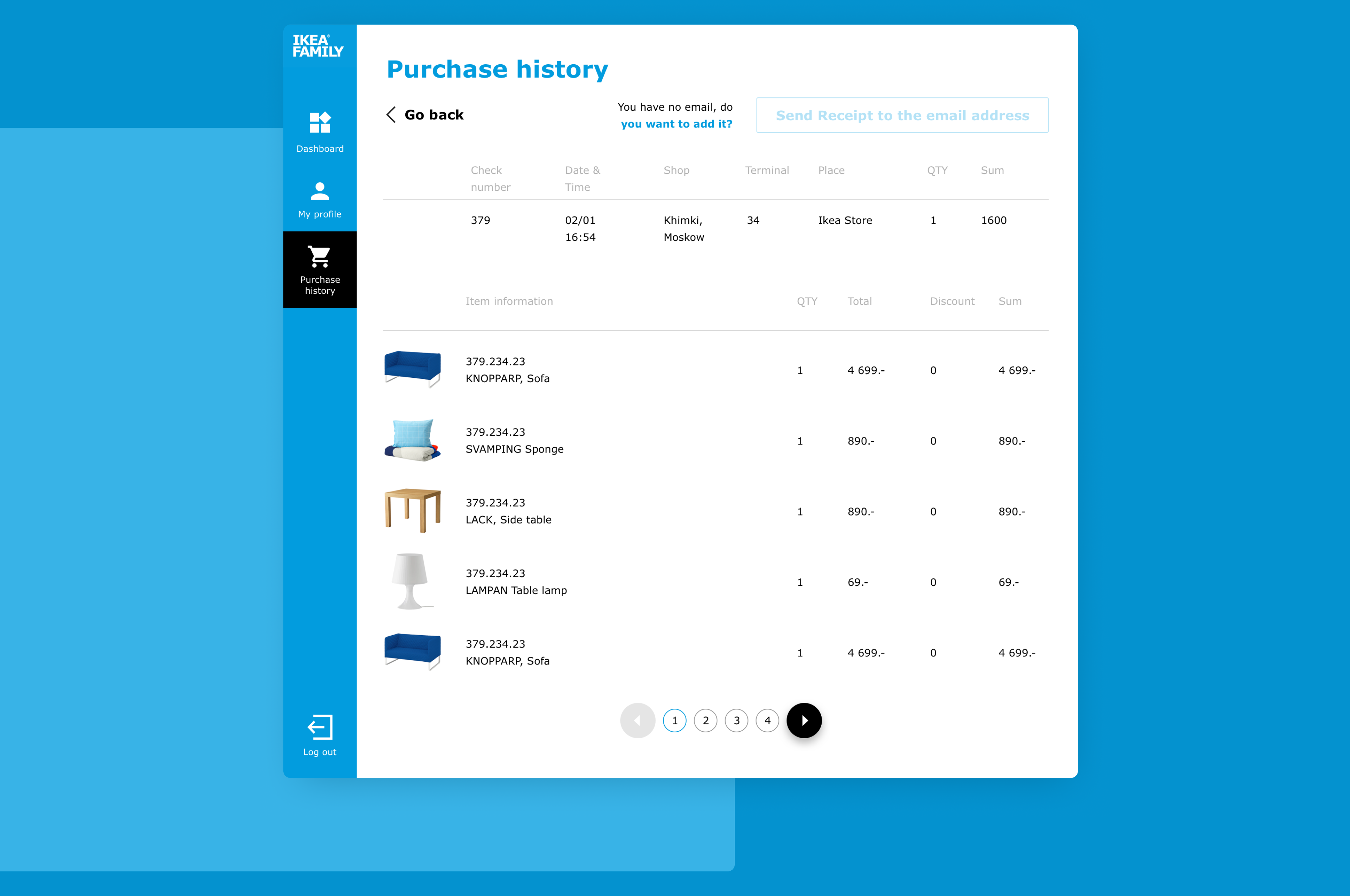
PURCHASE HISTORY
For orders and purchase history, we used the usual table view with order previews. We added filters using a search box, and date range boxes.
WEB AND MOBILE VERSION
We adapted the kiosk to the main web and mobile screens and devices so that IKEA Family members can have access to their accounts at hand.
IKEA BUSINESS
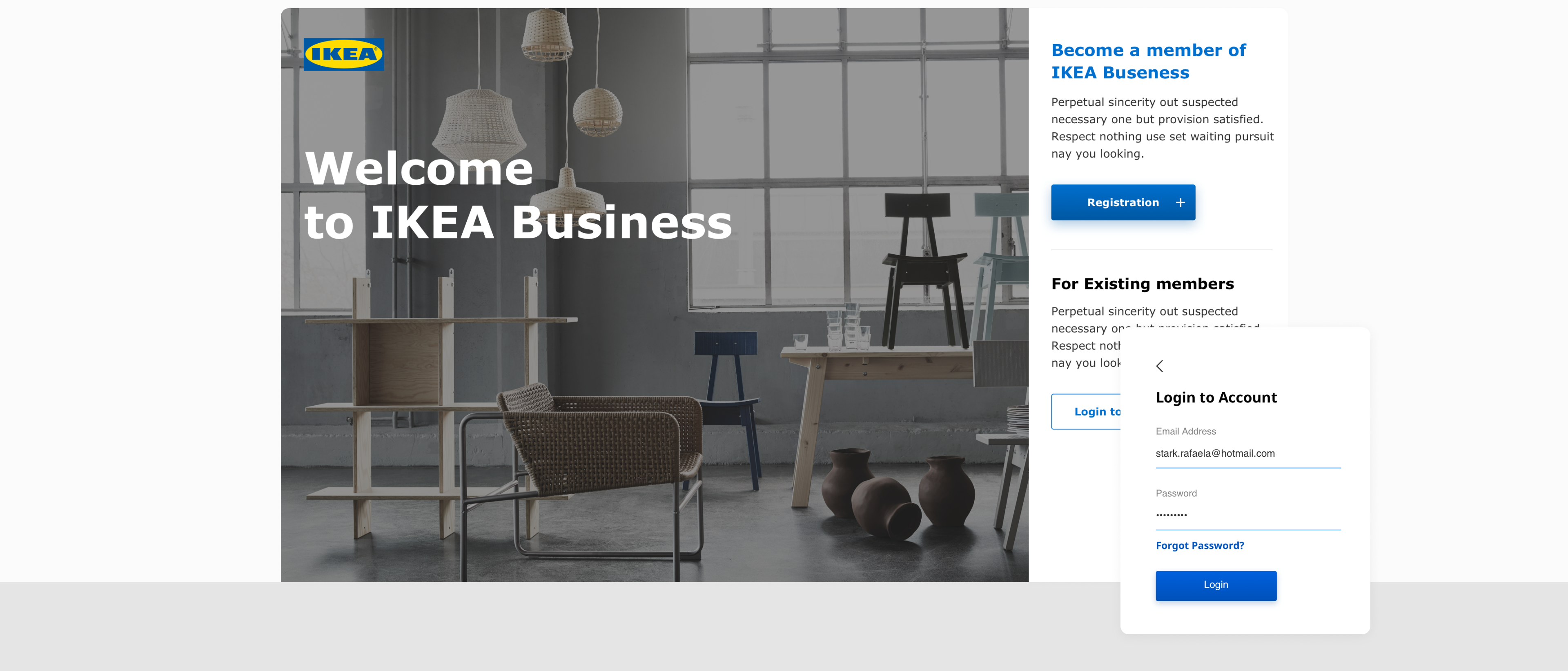
IKEA Business was created as a minisite, an extension to IKEA Family platform for corporate users. The main goals of the project were to improve business users’ satisfaction, get them real-time access to the company profile, orders and e-receipts, and to individualize the communication between different customer segments.
UX DESIGN
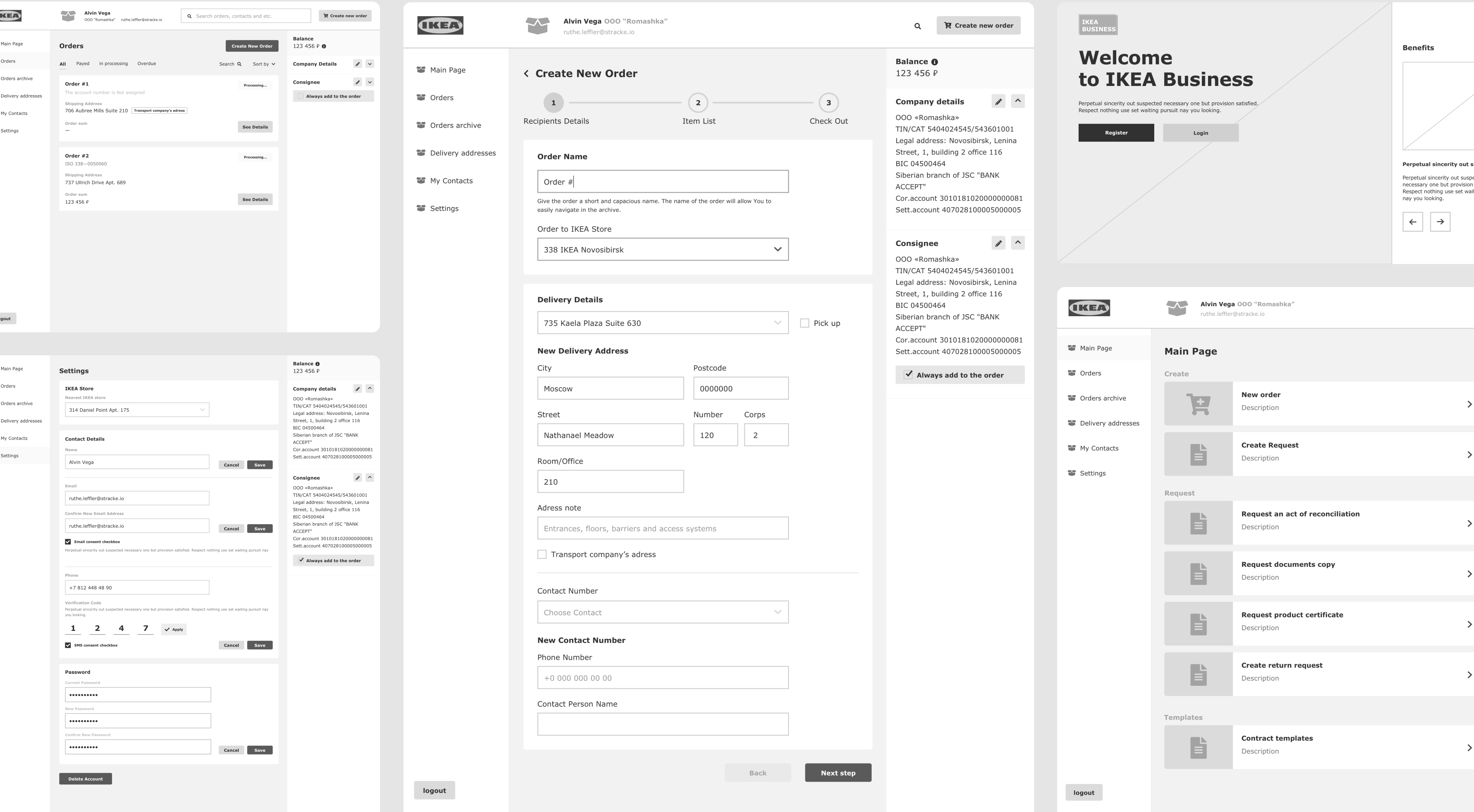
As long as the project was made from scratch, we started from cresting high-fidelity prototypes of the future system, that was further approved by the customer. The main sections included company information, company addresses, contact persons, communication approvals, attachments, system info, and transaction history.
UI DESIGN
The main challenge of the UI design stage was to combine IKEA’s design and brand guidelines with our vision of their web app, meticulously checking whether our design solutions comply with the highest standards of IKEA.
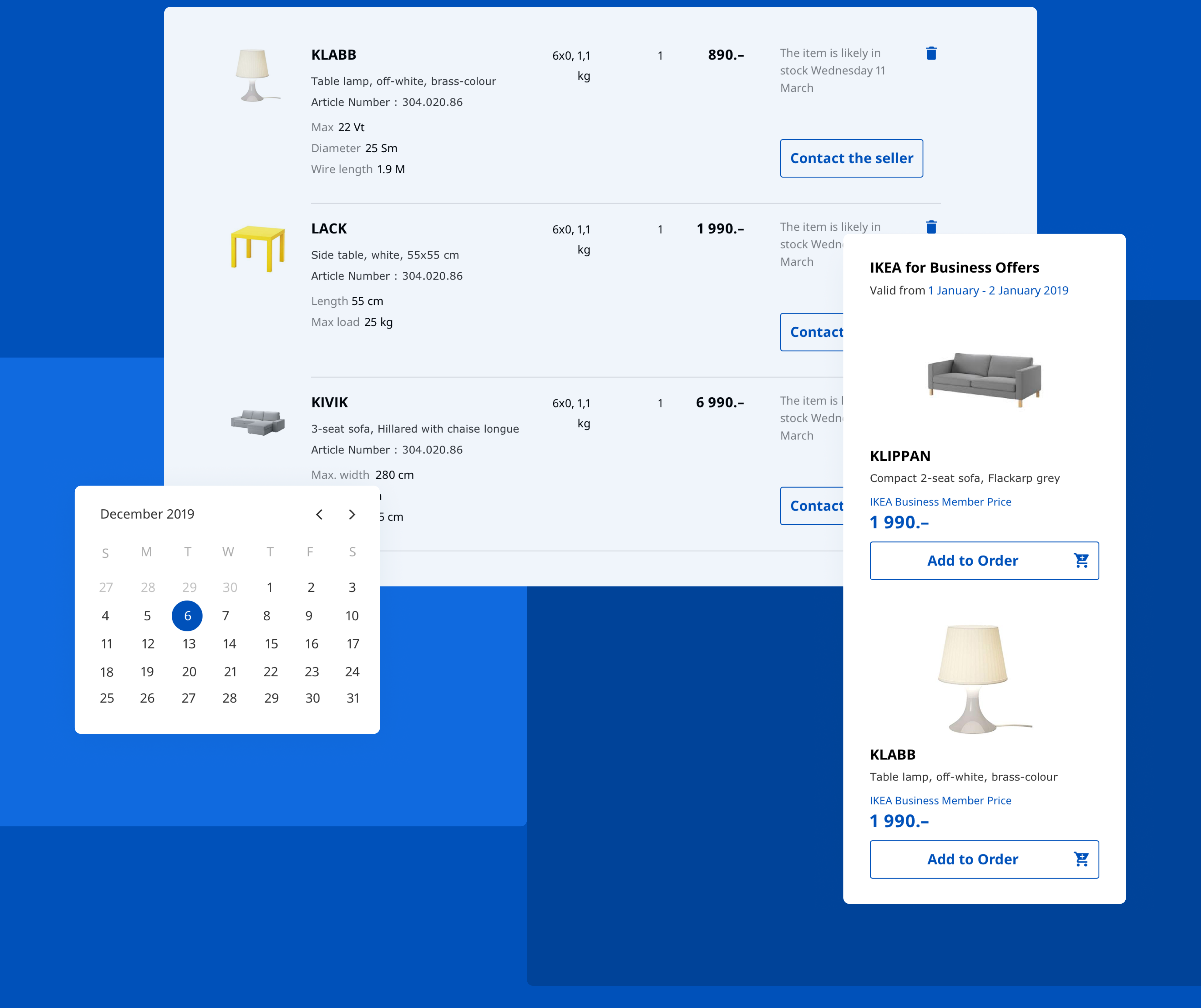
INTERFACE ELEMENTS
Following the best practices of minimalist design, we paid special attention to buttons, CTAs, product photos, digital receipts, and other important interface elements.
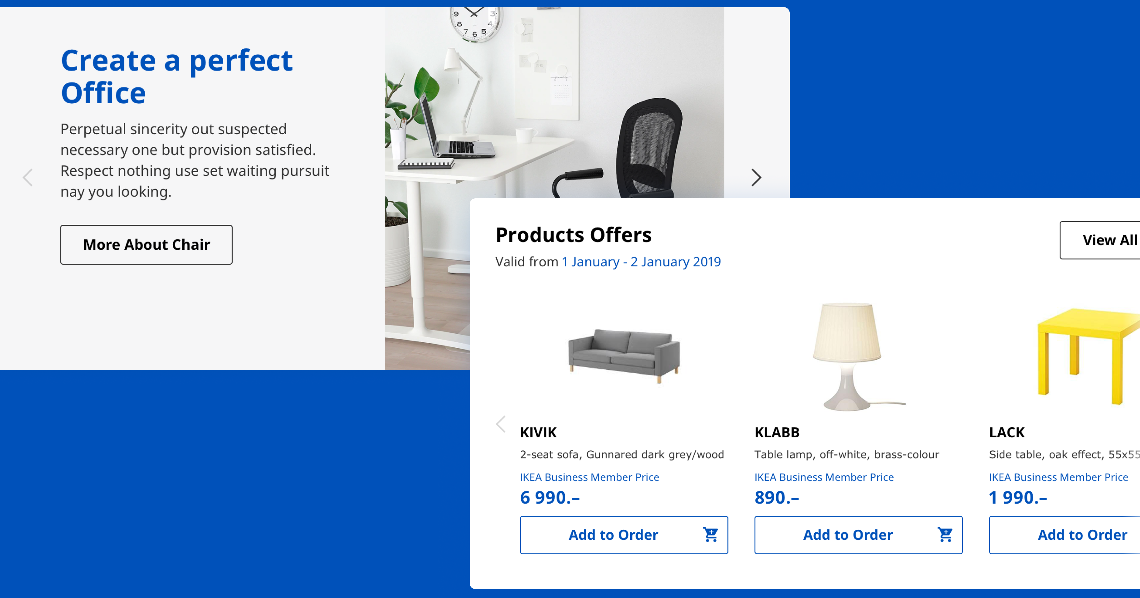
CUSTOM ICONS
Following the IKEA design guidelines, we created a set of custom icons for the Business Offers and Benefits sections of the app.
RESULTS
IKEA Business was created as a minisite, an extension to IKEA Family platform for corporate users. The main goals of the project were to improve business users’ satisfaction, get them real-time access to the company profile, orders and e-receipts, and to individualize the communication between different customer segments.
